
Simplicity Wins: A Marketing Lesson from Apple & Da Vinci
I love simplicity. I also struggle to practice it.
That might sound like a contradiction, but it makes sense when you know my background: journalism and SEO. Journalism trained me to use the inverted pyramid—put the most important thing first so the reader can bail anytime. SEO trained me (early on) that coverage and volume win.
Then along came the design mindset I respect most: Apple.
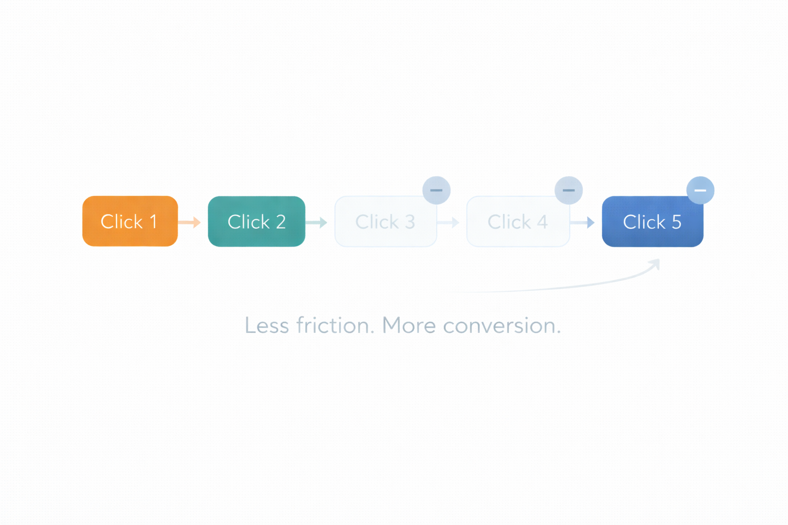
Less friction. Fewer clicks. Clear intent. No instruction manual required.
First: the quote
“Simplicity is the ultimate sophistication” is often attributed to Leonardo da Vinci (and sometimes Steve Jobs). Attribution aside, the principle is what matters:
Simple is not short. Simple is clear.
The real problem isn’t length. It’s friction.
Most marketing doesn’t fail because it’s too long. It fails because:
it’s confusing
it’s cluttered
it hides the point
it forces too many decisions
Simplicity isn’t “less information.” It’s less effort to understand and act.
Marketing is UX
Whether it’s a landing page, sales deck, email, or onboarding flow, the job is the same:
Make the promise obvious
Make the proof believable
Make the next step effortless
This is where my journalism background helps. The inverted pyramid is basically UX:
headline = what is this?
lead = why should I care?
body = proof + detail + how it works
CTA = what do I do next?
A friction audit you can run in 10 minutes
Pick any marketing asset and ask:
Can someone understand the offer in 5 seconds?
Do they know what to do next in 5 seconds?
Is a CTA visible without scrolling?
Are there more than 2 competing actions?
Did you add a second CTA where it naturally makes sense?
Can a skimmer get the whole story from headings alone?
Did you answer the top 3 objections?
Did you remove “maybe” words and vague claims?
Does the proof match the promise?
Did you cut anything that’s “interesting” but not necessary?
The “No Manual REQUIRED Test”
“Real men don't use instructions, son. Besides, this is just the manufacturer's opinion on how to put this together.” Love this Tim the Toolman Taylor quote from Home Improvement.
If your product or offering requires a manual or even a quickstart guide to understand it, you’re not done.
That doesn’t mean “dumb it down.” It means:
tighten the positioning
sharpen the language
structure the experience so the user learns by moving through it
Ultimately, your customer shouldn’t need your opinion on how to do something — they should just do it.
Here’s the irony
My SEO side wants to add more.
My Apple side wants to subtract.
The mature move is to do both:
Keep the depth for people who want it
Remove friction so nobody needs it
If you want simplicity, start by deleting. Not because short is better—because clarity is better.